This site uses cookies that are essential for our site to work. We would also like to use non-essential cookies to help us improve your browsing experience and help make this website better, by collecting and reporting information on how you use our site.
War of attribution: Patient addresses relative to attributed PCP
By
Michael Gleeson, Chief Strategy and Innovation Officer at Arcadia, Michael A. Simon, PhD, Director of Data Science at Arcadia, and Nick Stepro, Chief Product and Technology Officer at Arcadia
Provider attribution is fraught with unknowns. Sometimes, the patient chooses the provider, sometimes the choice is made for them. Sometimes, the provider is referred by a close and trusted resource, sometimes a name is picked randomly from a website. However, one factor — location — key to making choices in so many other fields seems often hidden from view, even as it can have a strong impact on patient engagement.
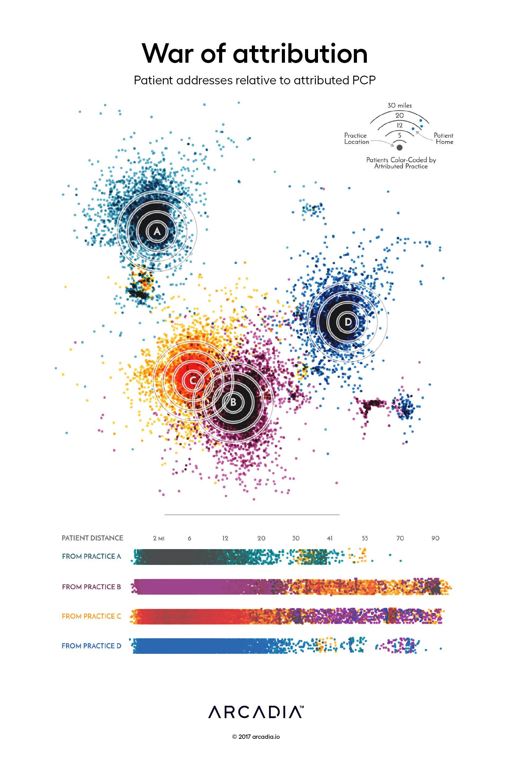
In this figure, the artists place the providers and their assigned patients (quite literally) on a geographic plane, laying bare the distance between them. Based on real data for 38,000 patients in an urban center, the four practices and their patients are color-coded to show their affiliation.
In the top section of the map, rotated and skewed to de-identify patients and providers, we see that most patients remain in fairly close proximity to their assigned providers. However, bursts of contrasting colors hint at the presence of patients with different allegiances.
The disruption of the correlation with distance becomes more evident at the bottom of the figure, as all patients within 90mi of a practice are presented along with the color of their attributed practice, revealing the close mix in assignments. How might patient engagement vary if a practice could bring in those closer-lying patients? How could a practice improve their outreach efforts to more effectively manage care for their further out patients?
Effective management of a community of patients demands a holistic view of patients’ lives; understanding the effect of distance, like many facets of this broader view, are only as far away as the data.
Details
D3.js SVG, with Illustrator Data sourced from Arcadia Benchmark Database with multiple EHR and Claims datasets
To leverage the latest automation and technology, healthcare organizations need a data analytics infrastructure they can build on. Here, Arcadia Chief Product and Technology Officer...
This article covers insights from Episode 1 of the series, which features industry leaders Michael Meucci, CEO of Arcadia, and Albert Marinez, Chief Analytics Officer at Cleveland...