This site uses cookies that are essential for our site to work. We would also like to use non-essential cookies to help us improve your browsing experience and help make this website better, by collecting and reporting information on how you use our site.
A drive to the doctor: 100K visits and the path to get there
By
Michael Gleeson, Chief Strategy and Innovation Officer at Arcadia, Dinesh Jayapathy, Data Engineer at Arcadia, and Nick Stepro, Chief Product and Technology Officer at Arcadia
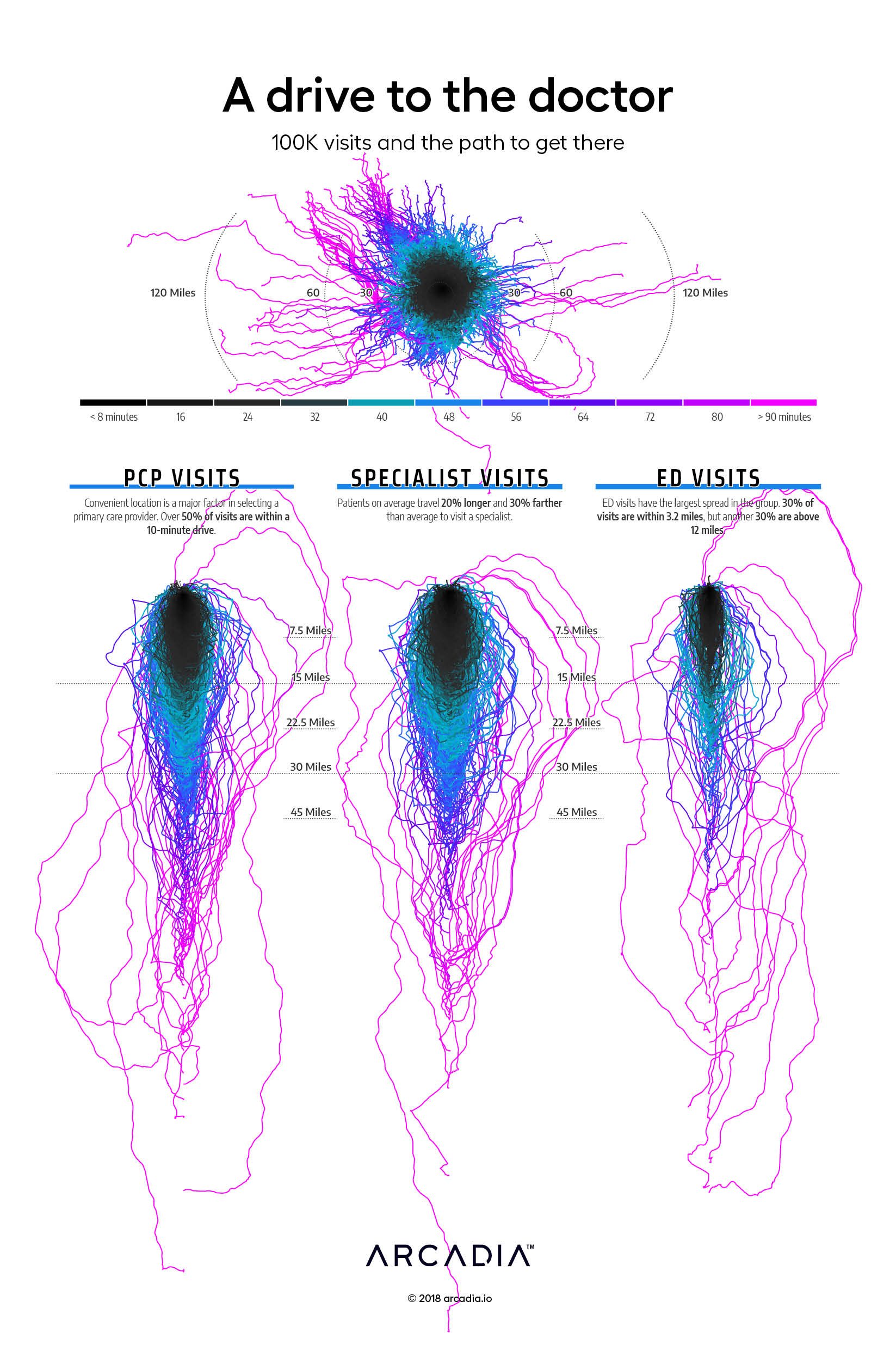
The relationship of a patient and their caregiver, be it a primary care physician, specialist, or hospital is fascinating. While many aspects of this relationship have been explored over the years in various publications, location is intuitively core to a patient’s decision-making process but is left inadequately explored. Perhaps location data is not available to the average researcher at a sufficient granularity, or perhaps until recently calculating driving routes at this scale would not be possible. In this work, the artists examine the way patients get to their doctors in unique detail, mapping the route patients take, and how far and how long they drive. It is a most intimate exploration of a frequently ignored part of healthcare.
The data shows the strength of a patient’s relationship with their primary care doctor, that patients tend to travel farther for a specialist, and that patients typically go to the closest emergency department. However, the artists’ representation of the data leaves the viewer with more questions, and a deep desire to explore this most important movement of people in more detail.
Core to this work is the artists’ decision to change how the viewer typically engages with routing data on a map. The artists calculated 100,000 individual driving routes between the patient’s home address and the practice location of their provider. Then all starting locations were aligned to the same point, and then the entire data set was cardinally shifted to align between the start and end point of the journey.
The result instantly engaging, and gives the viewer an opportunity to explore a massive data set quickly and make their own determinations about why and how patients travel to see their doctor.
Details
Python, GraphHopper, and D3.js, with Illustrator Data sourced from geocoded Patients and Facilities from a large IDN
Arcadia, a leading healthcare data platform, and Nordic Capital, a premier private equity investor in healthcare and technology, today announced a strategic partnership where Nordic...
Join us October 14 – 16, 2025 in Las Vegas at our annual conference to network and learn techniques to accelerate performance through data and analytics.
LAS VEGAS, NV – June, 16, 2025 – Quest Analytics, the leader in provider network design and management solutions, announced today a strategic data integration partnership with Arcadia,...