This site uses cookies that are essential for our site to work. We would also like to use non-essential cookies to help us improve your browsing experience and help make this website better, by collecting and reporting information on how you use our site.
In this work, the artists paid homage to Henry Gannet’s revolutionary data visualizations, which portrayed rankings of city population based on US Census data. Published in the Statistical Atlas of the United States in 1880, 1890, and 1900, those graphs of the top 40 cities ranked by population perfectly capture the growth of America’s industrial Midwest from the first census in 1790 to the height of the industrial revolution. By 1880, colonial maritime centers such as Newburyport or Charleston were overtaken by industrial powerhouses in St. Louis, Chicago, and Cincinnati, among others.
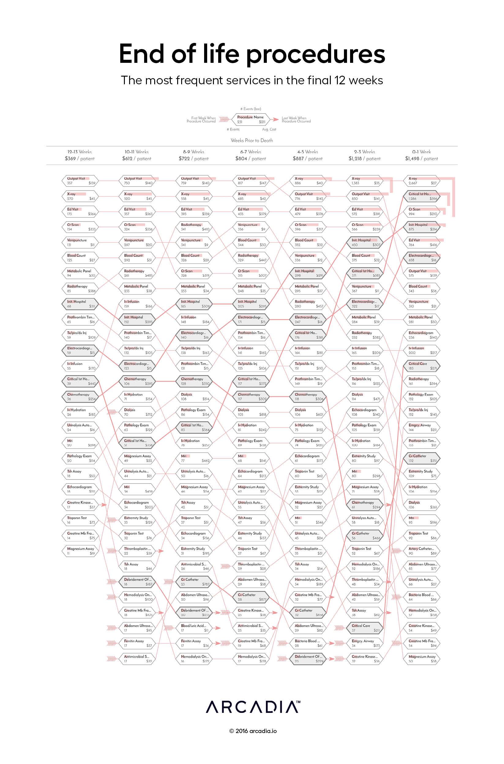
Rather than tracking the decennial census at each column, the artists defined seven periods of a patient’s end-of-life care, starting 13 weeks prior to death, and proceeding in two-week intervals until the date of death. In each phase, the top 32 most common services provided are depicted. Those services are then tracked by the ranking through each time phase.
The viewer can find a procedure of interest, and trace it across 12 weeks to understand how it fits in with other services offered at the end of a person’s life.
It is a thoughtful homage to a truly unique work from our history. As described in the Explanatory Text of the original figure:
The arrow-feather denotes the first entrance of a service to a list and the arrow-head its final appearance and exit, owing either to its decline in performance or its possible incorporation with another service. The color bars printed over the names of the services, indicate their relative population at each time phase.
Henry Gannet 1880
Details
SQL, D3.js SVG, with Illustrator Data sourced from Arcadia Benchmark Database with multiple EHR and Claims datasets
According to research from the CDC, approximately 129 million (nearly 40%) of people in the United States have at least one major chronic disease. Five of the top 10 leading causes of...
Whether operating under value-based care (VBC) contracts or traditional fee-for-service (FFS) models, improving care quality while managing costs is a major priority across the...
Arcadia, a leading healthcare data platform, and Nordic Capital, a premier private equity investor in healthcare and technology, today announced a strategic partnership where Nordic...