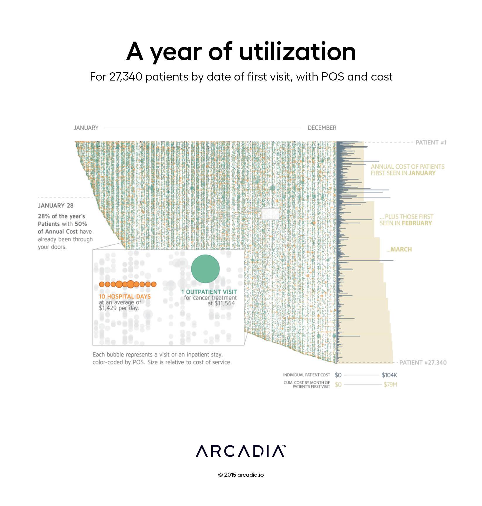
A year of utilization: 27,340 patients by date of first visit, with POS and cost

For an ACO managing nearly 30,000 patients, the quantity of data that builds up over a year is immense. This chart visualizes every visit for each of those patients over time. Every bubble represents an individual visit, with the size of each bubble showing the cost of that visit and the color representing the place of service (e.g., Hospital, Emergency Dept, etc.). These data are displayed in two dimensions: The x-axis represents time across a one-year span; along the y-axis, each row represents an individual patient, sorted by the date of their first visit that year.
Following the curve down the left side of the figure, created by the edge of the “first” patient arrivals during the year, we see that most patients in the ACO seek care within the first few months of the year and continue to do so regularly after that. These active patients represent a bulk of the overall cost for this patient population, as presented by the cream-colored area chart to the right. In fact, patients accounting for over 50% of this population’s annual medical expense will have already had their first visit by the end of January. This is because the most complex (and costly) patients seek care frequently and are far more likely to have an encounter early in the year.
This phenomenon can also be seen by stepping back and observing the gradient of dense bubbles in the top left, representing the more active, costly patients, fading to a much sparser spread in the bottom right, representing the less frequent utilizers of care. The point is further illustrated with the graphs to the right, where gray bars represent the total annual cost for each patient and the cream-colored area chart shows cumulative cost by the month of the first visit. Large spikes are far more prevalent at the top and the amount of cumulative growth slows as the year goes on.
Details
D3.js SVG, with Illustrator
Data aggregated from 3.97 million claim lines from 3 commercial insurers
