Insight
What Is Healthcare Analytics? The Definitive Guide
Healthcare analytics refers to the thoughtful use of data and statistical analysis techniques in the healthcare industry. Read this guide to learn more.

Misleading, right? After all, it references a number of the major chains, talks about the relative prices of Quarter Pounders across the country — and it is even called “Burgers and Fries.” But the most interesting thing about this data visualization has nothing to do with fast food — it’s actually about innovative ways to collect and combine public health data.
Data artist Simon Ioffe, a solution architect at Arcadia, made use of three very different approaches to gathering publicly available data: government-funded studies, automated information retrieval, and good old-fashioned fieldwork.
Federal and state government agencies fund studies that generate rich and interesting data, much of which is available online. During our next Arcadia Healthcare Datathon, we’ll be encouraging our teams to look for innovative ways to use this type of data to drive insights into healthcare challenges. The United States government makes invaluable resources available to the public at data.gov — and it can be worth exploring state and local resources as well.
For this data visualization, Ioffe used obesity data from the CDC Behavioral Research Factor Surveillance Study (BRFSS), an annual survey of close to 400,000 households about risk factor data that is the “largest continuously conducted health survey system in the world”.
The fast food locations are sourced from an automated web-crawler called fastfoodmaps.com developed by Ian Spiro. Spiro writes about his inspiration and screen-scraping approach on his website — similar to Ioffe’s data visualization, his work is about fast food on the surface, but is really a deeper exploration of insights gleaned from data visualization.
Ioffe and some of his fellow Arcadians collected nutrition facts from each of the restaurant chains described to support meal comparisons.
In combination, the data allowed Ioffe to create a composite visualization that brings together several visual elements.
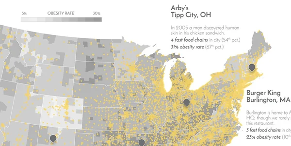
At the top, you can see a shaded choropleth of the BRFSS data overlaid by a scatter geolocation plot of the fast-food restaurants. This combines both data from the CDC study and from the web-crawler.
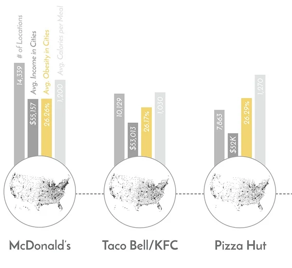
Below the choropleth, Ioffe compares statistics for each chain: number of locations, average income in those locations, average obesity in those locations, and average calories per meal at that chain. This information is rendered in a bar graph; the bar graph sits on top of a scatter geolocation plot showing the distribution of that chain’s restaurant locations across the United States.
At the bottom left, another bar graph compares 7 cities – 5 with the highest obesity rates and 2 with the lowest – on two different statistics: the number of fast food restaurants per 1000 people, and the obesity rate.
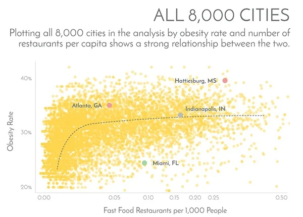
Ioffe also shows this comparison for all cities.
Notably, this graphic is not intended to imply causality between obesity, restaurant density, and income. However, this is a powerful example of the promise of marrying disparate health data sets for public health analysis, and we look forward to future work in this space.
Simon Ioffe is a solution architect at Arcadia. His data visualization work was advised by Nick Stepro, senior director of product management, and Michael Simon, PhD, principal data scientist, who also contributed to the text. Alyssa Drew is the strategic marketing manager.