ResourcesInsight

8 Healthcare Dashboard Examples and the Actions They Empower

By Logan Masta, Director, Special Projects at Arcadia
Posted:
Healthcare Analytics Population Health Management

Making informed, timely decisions is essential for delivering quality care, achieving operational efficiency, and improving financial sustainability. However, wading through overwhelming volumes of data can impact the accuracy and speed of these health-related decisions.

This is where healthcare dashboards come in to provide immediate clarity and context. These powerful analytics tools accelerate performance by empowering health teams to incorporate up-to-date data insights into their decision-making. This article explores what this process looks like for healthcare organizations.

Healthcare dashboard FAQs

What is a healthcare dashboard?

A healthcare dashboard is an analytics tool that helps users visualize critical metrics and key performance indicators (KPIs) to measure practice effectiveness and identify areas for improvement.

What are the different types of healthcare dashboards?

There are three main types of healthcare dashboards: clinical, operational, and financial. Let’s break down each of these types:

  • Clinical dashboards display data related to care quality and patient outcomes, such as patient satisfaction scores and average length of stay (ALOS).
  • Operational dashboards track metrics related to an organization’s administrative management, such as skilled nursing facility (SNF) utilization.
  • Financial dashboards measure an organization’s financial health through critical metrics such as per-member-per-month (PMPM) costs.

What is the purpose of a healthcare dashboard?

Healthcare dashboards are intended to help users quickly visualize actionable data, empowering healthcare organizations to make informed decisions and drive actions that improve patient outcomes and increase revenue.

What are the benefits of using healthcare dashboards?

Healthcare dashboards enable users to simplify and organize data, forecast trends, and improve care quality. Here is a breakdown of each of these benefits:

  • Simplify and organize data: With the ability to zoom in and out of various healthcare metrics, organizations can see a variety of data sets in a self-service fashion. By recording all critical data within a centralized location, healthcare dashboards make scattered, ad hoc reports a relic of the past.
  • Forecast trends: A holistic view of data from various sources equips users to monitor ongoing health situations and forecast future trends. These tools leverage machine learning and predictive analytics to forecast outcomes based on past and current data.
  • Improve care quality: With healthcare dashboards, healthcare professionals can quickly turn valuable insights into actionable care-delivery strategies. This informed decision-making results in enhanced enterprise-wide performance and an improved experience across all major stakeholders.

Common metrics that healthcare dashboards monitor

Different dashboards extract different healthcare dashboard metrics. Below is a list of the most important metrics to monitor.

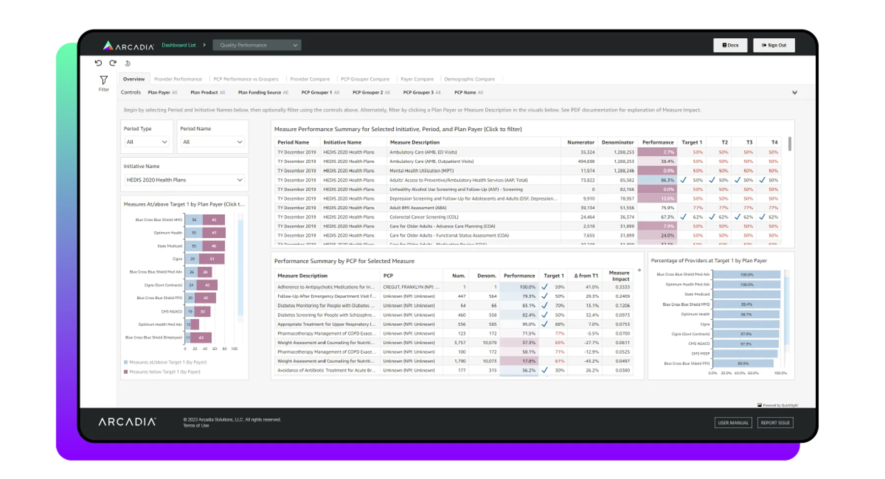
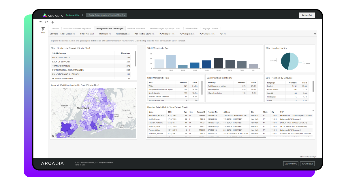
Patient satisfaction score

The patient satisfaction score reflects how patients perceive the quality of care and services healthcare facilities provide. Health professionals determine this score by assessing patients’ satisfaction with factors such as:

  • Treatment outcomes
  • Wait times
  • Facility amenities

Data from patient surveys and other feedback tools enable providers to assess the elements impacting patient satisfaction. When visualized through a healthcare dashboard, this data can even reveal long-term trends relating to patient-centric process improvements or gaps in care.

A high patient satisfaction score indicates a patient’s positive perception of a provider, which can ultimately lead to improved provider loyalty and reputation. Low scores, on the other hand, reveal opportunities for improvement.

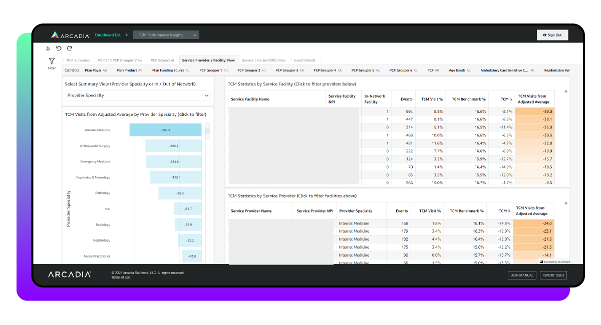
Transitional care management (TCM) data

Transitional care management (TCM) addresses the hand-off period between the inpatient and community setting. Relevant statistics show outcomes related to members who had a TCM visit billed by a physician following an inpatient discharge in which the patient was discharged to home, with or without home health.

Average length of stay (ALOS)

The average length of stay (ALOS) measures the number of days, on average, a patient spends admitted to a healthcare facility. To find the average, divide the total days patients spend in the facility by the number of discharges within a specific time period.

This metric enables providers to balance efficiency with quality of care. For instance, an extended stay increases the risk of developing other complications, such as acquiring a new infection from a hospital. However, releasing a patient too early could result in costly readmissions.

Contract summary data

This data tracks medical costs and utilization trends to inform payer-provider decisions. Contract summary metrics include:

  • Medical and pharmacy costs and utilization
  • The impact of high-cost claimants
  • Enrollment changes over time

When tracking contract summary metrics, timing is key. Payers should be able to view cost and utilization metrics in rolling 12-month or calendar year periods and evaluate trends from the previous period. This view allows payers to see high-cost claimants' impact on PMPM and visualize member enrollment trends over time.
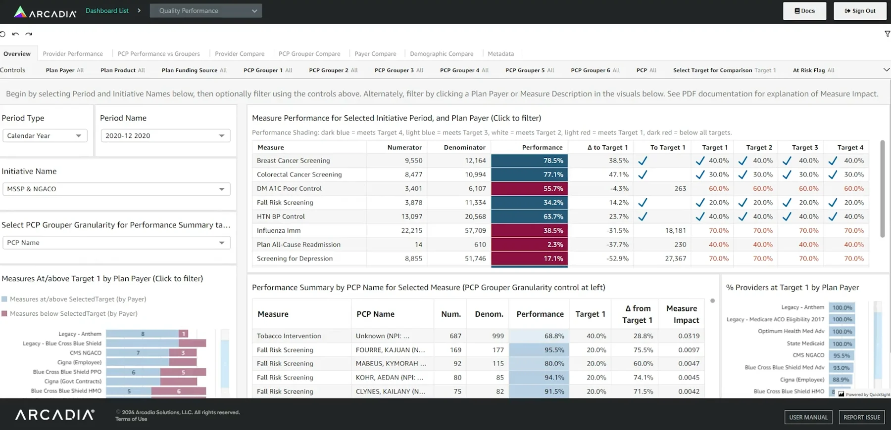
Readmission rate

Readmission rate refers to the percentage of patients who are readmitted to the facility within a specific time frame. Healthcare dashboards allow providers to monitor readmission trends, contributing factors, and the impact of interventions on reducing readmissions.
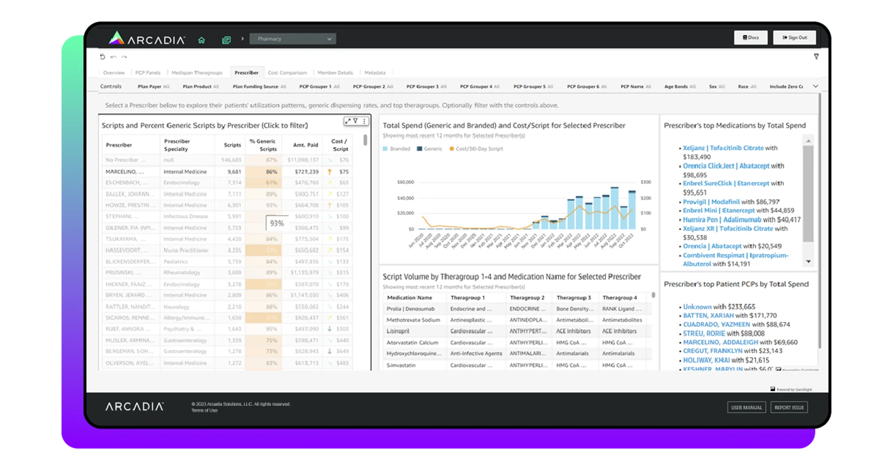
Cost per treatment

The average cost associated with a specific procedure or treatment may reveal opportunities for cost reduction without sacrificing the quality of care. To measure cost per treatment, health professionals must analyze all costs tied to the treatment, including:

  • Direct costs that are attributable to the specific procedure, such as staff time and medical supplies
  • Indirect costs which are necessary for the facility’s operation and aren’t directly tied to a particular treatment

Healthcare dashboards consolidate data across procedures, ensuring stakeholders have a holistic view of all relevant information. This way, health professionals can compare costs across procedures, identify outliers, and monitor financial efficiency.

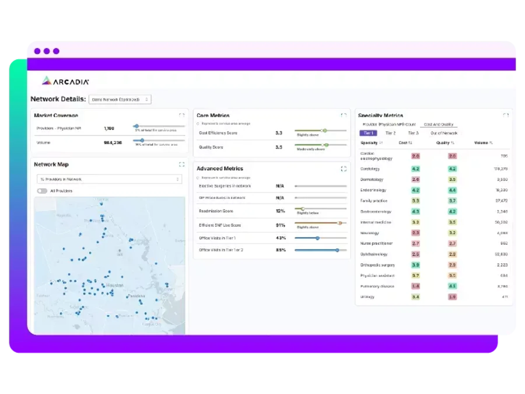
Skilled nursing facilities (SNFs) performance

Assess individual provider and facility performance by analyzing high-level inpatient trends and KPIs like:

  • Average SNF length of stay
  • Referral sources
  • % of SNF patients discharged home vs. readmitted

These metrics help health professionals identify facilities and providers in comparison to plan product and DRG-adjusted averages.

Areas where healthcare dashboards empower action

Healthcare dashboards can empower different actions based on the metrics and data they track. Most commonly, healthcare payers and providers can leverage their dashboards to make informed decisions that are relevant to their core responsibilities.

Healthcare providers

  • Population health: Large healthcare systems want to ensure they’re properly managing population health to avoid overextending their resources and take advantage of VBC contracts. By tracking population health KPIs, such as hospital readmission rates, providers can make more confident decisions about VBC and performance management.
  • Care quality and management: Healthcare providers often believe that they are performing well, and a healthcare dashboard provides the information they need to confirm or refute that belief. Dashboards provide clear data visualizations to assess their care quality, patient outcomes, and interventions, helping them identify where their primary focus should be and how to adjust their care management for improved results.
  • Risk adjustment: Clinical documentation staff operate in a highly regulated environment with compliance risk from payers and internal teams. Inaccurate information can make improving coding accuracy nearly impossible, but healthcare dashboards offer accurate insights that help providers improve documentation and coding accuracy.
  • Network strategy: Network strategy is most applicable to ACOs that include a mix of independent and health-system-affiliated specialists. By tracking metrics such as percentage of referrals to preferred specialists or specialist participation in value-based or performance-aligned arrangements, network strategy professionals align physicians with ACO goals and strengthen their healthcare networks.

Healthcare payers

  • Population health: Healthcare payers want to improve the effectiveness of patient care to reduce their costs and ensure their VBC strategies are financially viable. Insights into medical loss ratio, PMPM reductions across VBC contracts, and quality performance from healthcare dashboards show them how to adjust their population health strategies to achieve greater savings.
  • Care quality: Healthcare payers’ role includes identifying care quality gaps, ensuring providers are aware of them, and confirming that providers have acted on them. Data from healthcare dashboards helps them pinpoint where these care gaps exist, making it easier for them to communicate potential issues to providers.
  • Risk adjustment: Risk adjustment requires balancing plan needs with provider realities, ensuring programs drive measurable improvement without appearing burdensome to the network. Payers can leverage healthcare dashboards to identify documentation gaps, outline the problems for providers, and create workflows that support provider engagement.
  • Technology: Large healthcare systems often have to justify their technical spending, and healthcare dashboards help them do so. Tracking metrics such as system downtime, incident rates, security assessment performance, and IT costs per member enables healthcare payers to make informed adjustments to their technology strategy.
  • Network strategy: The cornerstone of network strategy for healthcare payers is ensuring their network delivers competitive cost, strong quality performance, and adequate access while supporting a broader VBC strategy. Healthcare dashboards enable payers to identify and advance high-value specialty networks by monitoring metrics such as specialty network performance relative to broad network benchmarks and the percentage of specialty spend under value-based or performance-aligned contracts.
  • Marketing: Growing membership profitably is a top priority for health plans, as their long-term success depends on their continued relevance in the market. Healthcare dashboards provide key insights that marketing staff can share when asked to explain why their network is a top pick, thereby growing membership.

8 healthcare dashboard examples


1. Quality Performance

This healthcare dashboard example explains how users can achieve improved patient outcomes through quality performance analysis.

Quality performance KPIs

  • Performance vs Target
  • PCP’s Measure Impact
  • PCP’s Overall Quality Rank (sum of measure impacts)

To efficiently care for patients while maintaining peak functionality, healthcare professionals must consistently evaluate their operational performance. Doing so ensures that their revenue streams remain profitable across all sectors. Healthcare quality performance dashboards give an adjustable bird’s eye view of performance management.

Arcadia’s quality performance dashboard measures the comparison between healthcare payers, primary care providers (PCPs), and additional healthcare providers all within a single initiative. Users can select an initiative and time period on the overview tab, and then easily view performance by PCP accompanied by a Measure Impact score. The Measure Impact score indicates to what degree an individual PCP positively or negatively “moved the needle,” impacting a network’s performance.

Three additional tabs allow users to compare entities (PCP, Payers, or PCP Groupers) in relative quality measures. Finally, a demographics tab highlights any variation in performance across lines of race, ethnicity, sex, language, and age.

Quality performance dashboards offer an adjustable solution to performance and operational decision-making by providing a clear window into your organization’s efficiency. From these metrics, you can formulate actionable fiscal and administrative recommendations for an increased ROI.


2. Transitional Care Management (TCM)

This healthcare dashboard example simplifies TCM and enables users to measure TCM performance across several management KPIs.

Transitional Care Management KPIs

  • TCM Visit %
  • TCM Benchmark Visit %
  • TCM Visits from Adjusted Average

Following an inpatient stay, there’s a phase known as transitional care management (TCM), which involves dedicating resources and time to managing a patient’s transition out of the hospital.

This phase usually occurs within a set 14-day management cycle following an inpatient medical or surgical discharge. In this phase, the discharged patient goes home with or without home health. TCM’s main objective is to ensure the patient is not readmitted to a hospital during this transitional period.

Effective data hygiene is necessary for every successful TCM program so that providers can measure changes after hospital discharges. That’s why a TCM dashboard is incredibly useful for providing insights following inpatient procedures. Reported metrics like visit rates, adjusted average benchmarks for PCPs, facilities, and providers, and PCP scorecards give context for TCM performance.

Users can also adjust views to read a TCM summary and then move into analyzing TCM across a PCP Grouper view and DRG (diagnosis-related groups) view for event details. Effective TCM tracking and analysis improves administrative workflows and offers insights for providers to identify and close gaps during this critical period.


3. Ambulatory Surgery Centers (ASC)

With ASC healthcare dashboard example users can measure exact cost efficiency rates in comparison to traditional outpatient hospitals.

Ambulatory Surgery Centers KPIs

  • Percentage Events ASC
  • Cost per Event
  • Facility Type

Surgeries within ambulatory surgery centers (ASCs) do not need hospital admission. They are cost-effective and convenient in comparison to traditional outpatient hospital settings. However, without proper data tracking and analysis, many providers do not know exactly how much more cost-effective ASCs are.

Arcadia’s dashboard compares the exact cost per event in ASCs and outpatient settings. Correspondingly, it allows users to model the potential savings of shifting care from outpatient to ASCs by contract type. This means that users can make informed decisions based on cost and event trends available in four distinct views:

  • Line of business view
  • Service category view
  • Procedure view
  • Provider view

ACO Leaders and Business Analysts can then leverage cross-customer benchmarks to investigate the percentage of events performed in ASCs with the ASC percentage slider. Arcadia customers can know the true difference in cost with a robust ASC dashboard.


4. High-Cost Members

Explore how you can measure high-cost members in this healthcare dashboard example.

High-Cost Members KPIs

  • High-Cost Cohort (Admission, Condition, Drug, Maternity, Rare Condition, Unclassified)
  • Cost Type (Inpatient, Outpatient, Pharmacy)
  • Impact Score Category (Arcadia Arc Score)
  • Condition by Impactability (Very Strong Potential, Strong Potential, Good Potential, Some Potential, Not Recommended)
  • Total Members
  • Total Cost

Factors like chronic conditions, expensive medications, and maternity cases identify some patients as high-cost members within a healthcare organization’s framework. Arcadia differentiates these members from others by advanced filtering capabilities.

For example, the Arcadia High-Cost Member dashboard provides a member overview and then breaks members into high-cost cohorts and cost types by Plan Payer. Additionally, the Impactability tab shows conditions and PCP Groupers by impact score categories. Finally, the Patient Detail tab offers several filters for a more in-depth view of each individual patient. These patient filters include:

  • Impactability
  • High-cost cohort
  • Minimum total cost
  • PCP visits

Arcadia’s High-Cost Members dashboard categorizes patient data into several comparable tabs and uses a variety of KPIs to give users an informed look into high-cost members.


5. Social Determinants of Health (SDoH)

The social determinants of health healthcare dashboard example discusses how organizations can take a practical step towards health equity.

Social Determinants of Health (SDoH) KPIs

  • SDoH PMPM
  • Population PMPM
  • SDoH Concepts
  • Member Count
  • SDoH Condition Prevalence
  • Avg. IP Stays per Member
  • Avg. ED Visits per Member

Social Determinants of Health (SDoH) data are among the most crucial factors an organization can use to mitigate risk, improve patient outcomes, and achieve financial success. This data explains what’s happening in a patient’s life outside healthcare settings so PCPs can provide the care each patient needs without sacrificing time to investigate outside factors. 

Arcadia’s SDoH dashboard identifies SDoH challenges through analysis of claims and critical data in addition to care management and clinical assessments. All of these insights are then sifted into distinct tabs:

  • Utilization
  • Spending
  • Demographics
  • Geoanalysis
  • Condition prevalence
  • Language concerns

From there, users can switch between complementary dashboard tabs, such as the Member Analysis and Cohort Builder tabs, to dissect the impact of these patterns and view member-level details.

When furthering health equity is the goal of SDoH data analysis, users need a robust solution to help them gather new insights and uncover population health patterns. That’s why Arcadia makes healthcare equity initiatives achievable.


6. Benchmarking

Benchmarking KPIs

  • Cost of care
  • Service utilization
  • Risk score
  • Performance quality

Healthcare organizations must benchmark their internal performance against external, market-based standards to truly excel in value-based care. This comparative analysis helps organizations identify performance blind spots, uncover opportunities for improvement, and adopt best practices to enhance care quality and operational efficiency. Healthcare benchmarking dashboards offer comprehensive insights across providers, practices, facilities, and entire networks.

Arcadia empowers healthcare organizations to access these insights with integrated benchmarks powered by market intelligence and a de-identified dataset of over 20 million lives across multiple payer types. These benchmarks allow organizations to:

  • Analyze cost, quality, and utilization metrics against national, regional, and peer-level standards
  • Identify high-performing providers and practices and emulate successful models across networks
  • Detect underperforming areas and implement targeted practices to improve outcomes

7. Network Integrity

Network Integrity KPIs

  • Provider efficiency scores
  • Referral patterns
  • Capacity utilization
  • Attribution trends

Network integrity reflects a health system’s ability to retain patients within its defined provider network. Understanding patient retention enables providers to enhance care coordination by refining referral processes and using resources more efficiently. To accomplish this, health professionals need to track patients through the continuum of care.

Arcadia’s network integrity dashboard offers comprehensive insights into patient retention and leakage patterns. The dashboard offers both high-level summaries and granular analysis, including spending patterns in and out of the network during critical periods, such as the 90 days following a new specialist visit.

Healthcare organizations can use Arcadia’s Network Modeler to design, build, and evaluate networks at scale. Powered by data from more than 900,000 providers nationwide, organizations can:

  • Identify high-performing providers to expand into new geographies strategically
  • Optimize existing networks to balance cost, quality, and access
  • Gain visibility into population statistics to address disparities and promote health equity

8. Polypharmacy

Polypharmacy KPIs

  • Medication count per member
  • Pharmacy cost trends
  • High-risk medication prescriptions

Polypharmacy is the use of multiple medications by a single patient. If not properly managed, polypharmacy can pose significant risks, including harmful drug interactions, reduced medication adherence, and unnecessary healthcare costs.

Healthcare organizations can address these risks by identifying impacted patients, simplifying care management team processes, and preventing unnecessary overmedication. Healthcare polypharmacy dashboards support these efforts by highlighting harmful drug combinations and drug cascades and analyzing medication use across patients.

Arcadia’s polypharmacy healthcare dashboard supports clinical pharmacists in identifying members with the most distinct medications in a 90-day window and members with potentially harmful or costly drug combinations. This visibility helps reduce adverse drug events and improves patient outcomes by enabling targeted interventions.


How Arcadia can help with healthcare dashboards

Modern healthcare dashboards, such as those Arcadia offers, make data more accessible to analysts and leaders across functions by providing a growing library of healthcare intelligence dashboards built on a data platform that’s optimized for value-based care.

Arcadia’s solution helps organizations move beyond passive reporting to active performance improvement by:

  • Simplifying and securing data-insight distribution
  • Providing ROI projections across specific lines of business
  • Empowering self-service analytics
  • Driving actionable interventions

By leveraging Arcadia’s platform, your organization can transform raw information into critical insights and predictive analytics that drive actions that improve patient outcomes and operational efficiency. Experience the data-backed difference, empower your team to innovate, and revolutionize your operational efficiency with Arcadia.

Use healthcare dashboard software to empower care teams

Equipped with intelligent healthcare dashboards, teams across the healthcare ecosystem can take data analytics to the next level. Implement dashboards that help identify healthcare trends and holistically view population health to empower your organization to act with data-driven innovation.