Webinar
Operationalizing LEAD: Network Benchmarking with Arcadia’s VBC Navigator solution
Learn about how Arcadia’s VBC Navigator solution can assist in making network decisions for LEAD participants.

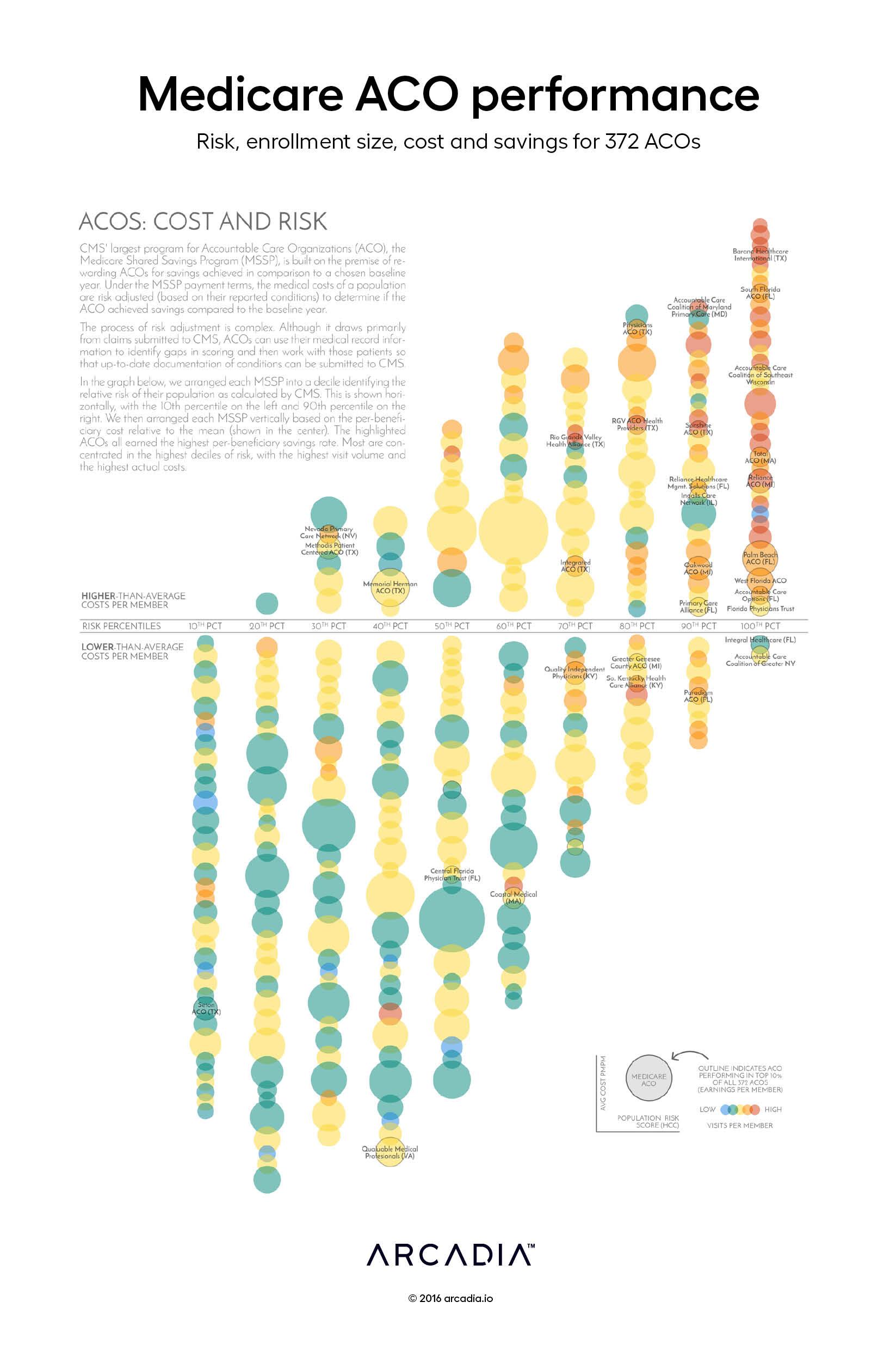
Risk scoring underpins many value-based payment programs. In the CMS Shared Savings Program, risk adjustment is critical to the fair calculation of the savings rate and, ultimately, the success of the ACO.
In this graph, the artists seek to identify the relationship of risk-scoring to other factors such as cost, size and access. The most successful ACOs, judged by their earned savings rate adjusted by a quality modifier, are noticeably clustered in the top 30% of identified risk, and are also the highest-ranked for per-capita costs and per-capital outpatient utilization.
The bubbles, representing ACOs, are arranged by decile corresponding to the relative aggregate risk score of their populations. Vertically, the bubbles are arranged in order by cost per member. The sizes of their relative populations are represented by bubble size, while the color of each bubble reflects the per-member visit volume relative to the group, from blue (lowest) to red (highest).
Do more visits simply generate more coding leading to higher risk scores? Or do riskier populations need more services and the risk score is accurately smoothing performance? The graph doesn’t explicitly provide an answer. However, MSSPs have the data to accurately predict where they might land.
MSSPs received fully-identified claims files that Arcadia uses to identify missed opportunities for improved risk scores based on clinical data. By highlighting these discrepancies, MSSPs see a more accurate representation of their population, as well as help care teams stay up-to-date on patient condition history.
The graph layout was inspired by a New York Times analysis of state primary elections by Nate Cohn and Josh Keller in which states were identified as liberal or conservative based on an identified score derived from polling data, similar to this more recent visualization by the same team.
Excel, D3.js SVG, with Illustrator.
Data sourced from 2014 CMS ACO Public Use File.