Insight
Top 10+ Population Health Management Software Solutions
Population health management software like Arcadia enables care delivery to entire populations. Learn about population health management tools in this guide.

The Electronic Health Record is a data gold mine. Each patient you see generates millions of detailed records in real time that can be extracted and analyzed for improved predictive algorithms, increased operational efficiency, better care quality, and so much more.
Unfortunately, electronic health records (EHRs) are highly complex systems, and few organizations house the domain knowledge and analytical horsepower to fully take advantage of them.
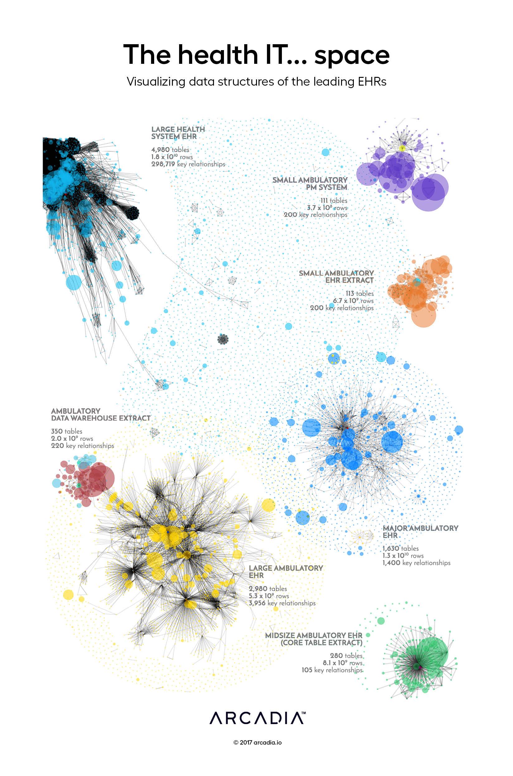
This display contains a stylized Entity Relationship Diagram for each of seven distinct EHRs, with nodes each representing a data table within the platform. Relationships between the tables are drawn as gray lines, inferred from shared attributes of each table. In each cluster, the core patient entity — the nucleus around which the rest of the data revolve — can be identified by its contrasting color. The tables containing the bulk of the clinically and operationally valuable data tend to form clusters of large, interconnected nodes, while a larger number of satellite tables house system configurations and other low-volume metadata that has very few relationships to the nucleus.
Each EHR’s distinct data structures and usage patterns provide it with a unique visual profile, where the density, size, and interconnectedness of the data vary greatly from one to the next.
D3.js SVG, with Illustrator
Data sourced from Database metadata from several leading national EHRs