This site uses cookies that are essential for our site to work. We would also like to use non-essential cookies to help us improve your browsing experience and help make this website better, by collecting and reporting information on how you use our site.
The healthcare system is the union of two worlds: The world of care for the individual — from the visit with a physician to develop an individualized care plan, to the coordination of ongoing condition management based on the patient’s needs and lifestyle — and the world of population health management — from coordination of care for complex cohorts, to sophisticated assignment mechanisms intended to balance capacity, capabilities, acuity, risk, and resources, to sophisticated contracts with incentives meant to promote value-based care.
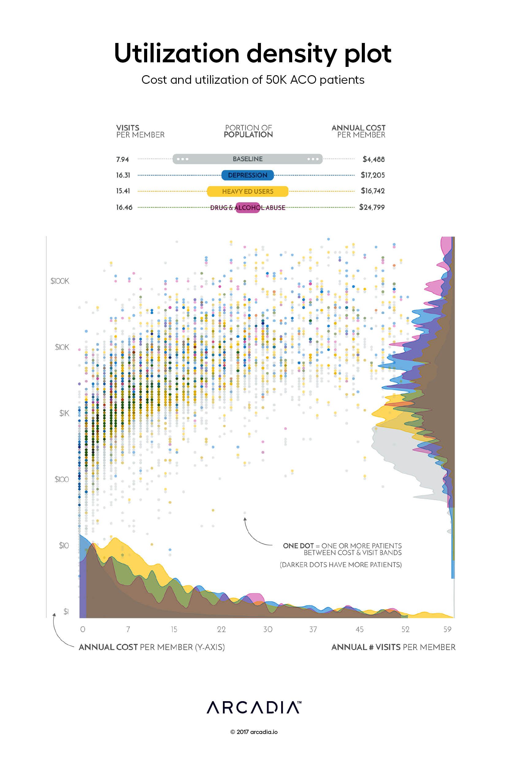
In this work, the artist attempts a visual balancing act of these two worlds, simultaneously representing the vast N of a population while retaining the foundational power of the one.
Throughout the center of the figure are 50,000 colored points, each point representing one individual and colored according to membership (or not) in one or more of three cohorts. The positioning of each patient’s point represents the healthcare utilization of that individual, both in number of visits (x-axis) and total cost (y-axis). Each point offers the intimacy of a single life, while the collection suggests the energy and directionality of a community.
Framing the points are the world of the population, starting with descriptive statistics at the top. Below and to the right of the individual points are histograms, describing the distribution of the population and cohorts by annual visit count (against x-axis) and annualized cost per member (against y-axis). At a glance, one can see the general distribution of utilization and the trends of specific cohorts: the long tail of visits for heavy ED users, the long tail of cost of substance abuse.
Viewing the picture of the individuals through the frame of the population offers an allegory for the effective use of healthcare data: The observer gains powerful insights into how resources are used at the population level, while never losing sight of the individuals served by the system.
Details
D3.js SVG, with Illustrator Data sourced from Arcadia Benchmark Database with Claims Datasets
Arcadia, a leading healthcare data platform, and Nordic Capital, a premier private equity investor in healthcare and technology, today announced a strategic partnership where Nordic...
Join us October 14 – 16, 2025 in Las Vegas at our annual conference to network and learn techniques to accelerate performance through data and analytics.
LAS VEGAS, NV – June, 16, 2025 – Quest Analytics, the leader in provider network design and management solutions, announced today a strategic data integration partnership with Arcadia,...