Weaving hospital variation, explained
Bronchitis treatment can cost you up to $8,000 dollars in a hospital in Boston, MA. The same treatment, in the same region, at a provider of similar size, can cost one-quarter of the price.
This a common, but baffling trend in healthcare: billed amounts for common procedures vary wildly from hospital to hospital. This variability can be inferred from the CMS (Center for Medicare/Medicaid Services) Cost and Quality Report, though it is obscured by thousands of rows, medical procedure numbers, and claims terminology. In order to make this information more accessible, we contextualized and visualized cost and quality data for the two thousand providers included in the Medicare dataset.
Parallel coordinate charts: from 19th century population shifts to 21st century hospital data
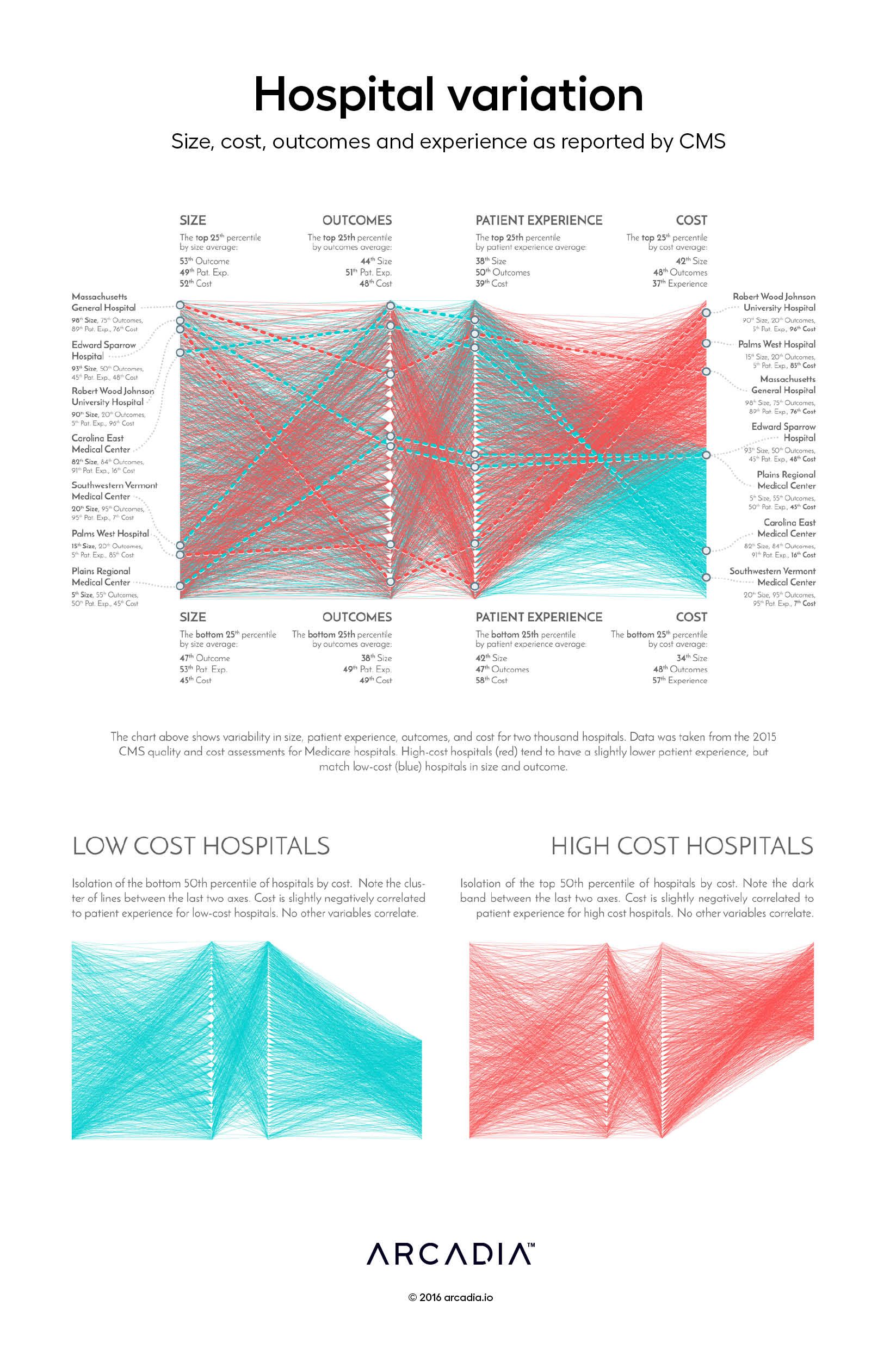
In this graphic below, we took a macroscopic view of billed costs, hospital size, quality outcomes, and patient experience. The information is laid out a like a loom, on which threads representing each hospital weave along a path based on those four key factors. Also referred to as a parallel coordinate chart, similar visualizations have been used to monitor air-traffic collisions and population shifts dating back to the 1880’s.
Each of the four axes represents a ranked distribution from the lowest to highest value of each of the metrics. The triangle-shaped gaps on the center axes are formed as each ‘thread’ bends around what would be a ‘reed’ in a real loom. The direction of the various threads indicate correlation between the four factors: a horizontal path indicates similarity between the concepts, while a strong positive or negative slope indicates variability between the factors. Color is used to further classify the hospitals based on their median performance, from blue (lowest cost) to red (highest cost).

More about our methods: creating a hospital profile
We distilled billed Medicare cost for each provider to a single percentile-weighted number. Our cost index aggregates billed amounts for procedures, weighted by frequency and price in comparison to other hospitals. Quality information – broken down to patient experience of care and outcome ratings – was linked to cost for each provider. The CMS patient experience rating is based on a survey encompassing medical staff communication, pain management, and hospital environment. Outcome takes into account mortality, infection rate, and functional ability following discharge.
Using the number of procedures as a proxy for hospital size, we were able to evaluate each hospital on the axes of cost, patient experience, outcome, and size. Hospital performance profiles were developed by standardizing all four comparison variables on percentile scales. For example, a hospital with low cost percentile scores and high quality has a high-performing profile.
The quantitative relationship (shown in the correlation matrix below) is relatively clear: cost and patient experience bear a slight positive correlation (r = .27), and all other correlations are negligible. Visualizing these performance profiles allowed us to see a more nuanced relationship between cost, quality, and size.


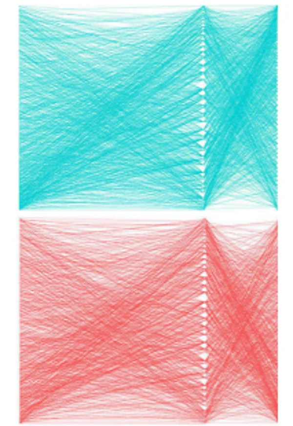
Displayed visually, the relationships between each axis is much more intricate. You may notice the two X-shaped weaves between the axes of size and outcome, and outcome and patient experience. Displayed as a simple correlation factor, the relationship between these axes is non-existent (r = 0). This visual, however, points to a trend that we had not noticed quantitatively: there is an anti-correlation (for both high and low cost providers) between the two pairs of variables. We see a clustering of hospitals with large size and low outcome forming the downward slope of the X and low size, high-outcome hospitals creating the upward slope. A similar trend exists for outcome and patient experience (second and third axes).
Looking forward: visualizing variability
There is no single way to interpret this parallel coordinate chart. The viewer can start on either side, and choose any number of variables to compare. Relationships between variables can be observed in relatively high granularity – viewers can dissect the distribution of each correlation.
By lowering the barrier to access the CMS cost dataset, our visual empowers the general public to develop a nuanced understanding of cost variability. At a broader level, our chart elucidates the opacity of healthcare pricing – and encourages healthcare drivers to address medical pricing.
Omar Nema and Abhi Kumbara are technical data analysts at Arcadia; they created the Weaving Hospital Variation data visualization after exploring ways to bring healthcare cost and quality data to consumers during the Arcadia Healthcare Datathon. This project was advised by senior director of product Nick Stepro and principal data scientist Michael Simon, PhD.
