This site uses cookies that are essential for our site to work. We would also like to use non-essential cookies to help us improve your browsing experience and help make this website better, by collecting and reporting information on how you use our site.
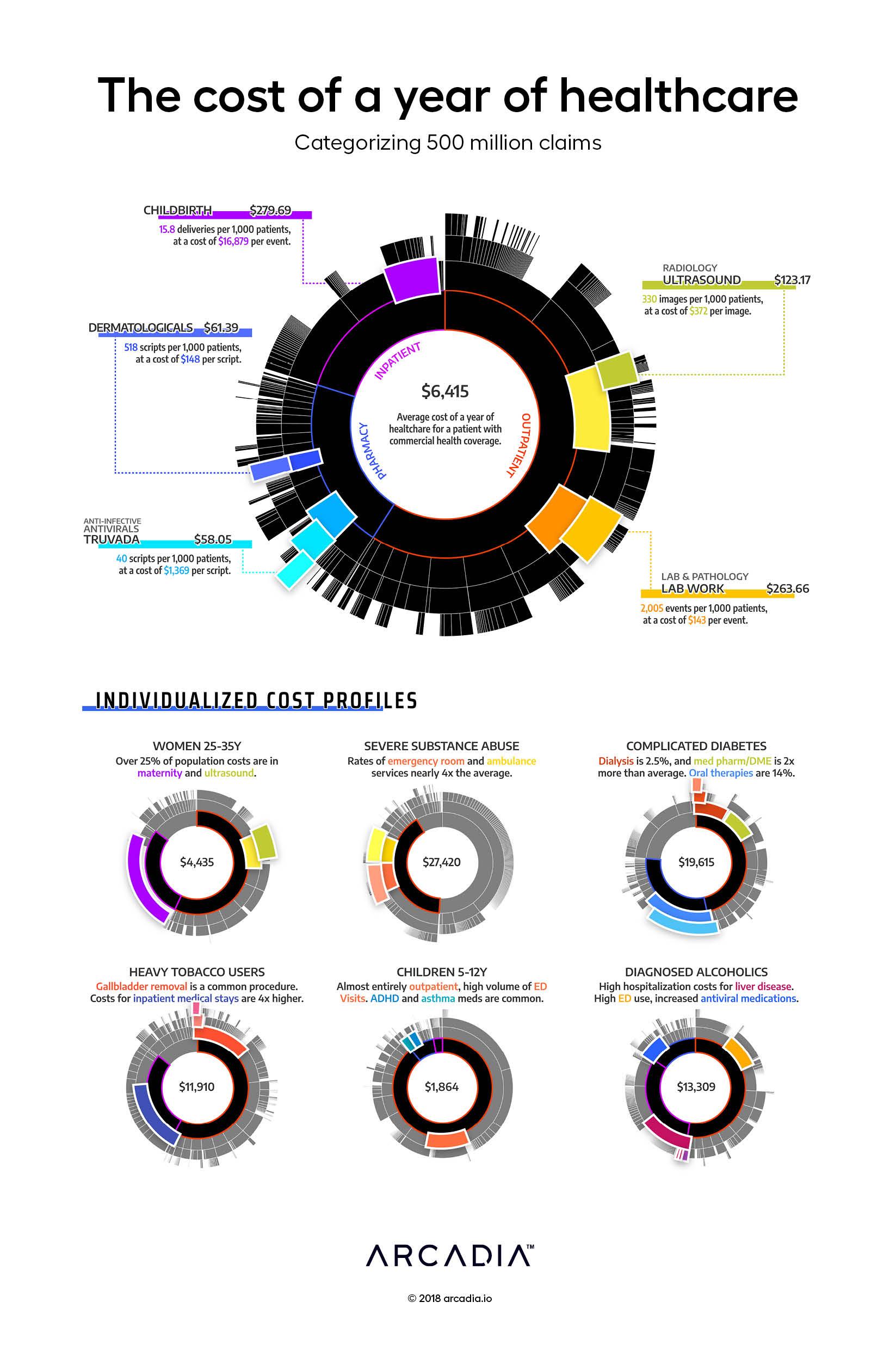
For many fortunate people, a year of healthcare is inexpensive — a couple office visits, some medications, an urgent care visit when that bug goes around. For many others, the story is quite different. We build insurance pools of thousands of patients, ensuring that when one patient has a bad year, those that are fortunate to have a good one can help cover the cost. For a commercial payer (combined data for dozens of which are displayed in this figure), the average annual cost of care for that pool is $6,500 per year per patient.
Sifting through the population, the artist pulls out certain cohorts that exhibit unique cost and utilization patterns. The thirty-year-old woman, whose cohort on average spends 25% of annual costs on childbirth (one event can cost $15,000–$30,000). The patient struggling with severe substance abuse, who spends dozens of nights in the ED. A complex diabetic, with costly medication regimens. The diagnosed alcoholic, with severe complications of the liver. The young children, bouncing into the ED for the occasional cold or broken arm.
The complex patterns of our healthcare spending are just a reflection of the broad and rich tapestry of our shared humanity. Billions of people, each different, but bound by a common desire to thrive, and a common set of obstacles. The healthcare system, then, is more than just an intricate network of hospitals, clinics and insurers. It is our society’s best attempt to lift its people up and help them thrive in the face of frequent and overwhelming corporeal limitations.
Visually, the artist uses a sunburst diagram, which enables an intuitive display of the complex hierarchical event grouping and service categorization used in the Arcadia Analytics data platform. 500 million claims are categorized and lumped into service lines and cost categories for easy analysis and variation analysis
Details
D3.js SVG, with Illustrator Data sourced from Commercial Claims from Arcadia Benchmark Database
Whether you're a data operator aiming to streamline processes or a tech enthusiast eager to understand cutting-edge analytics, this workshop (formerly known as Intensive Training) will...
According to research from the CDC, approximately 129 million (nearly 40%) of people in the United States have at least one major chronic disease. Five of the top 10 leading causes of...
Whether operating under value-based care (VBC) contracts or traditional fee-for-service (FFS) models, improving care quality while managing costs is a major priority across the...