Insight
Top 10+ Population Health Management Software Solutions
Population health management software like Arcadia enables care delivery to entire populations. Learn about population health management tools in this guide.

An alternative to the force-layout network diagram, an Adjacency Matrix can provide a cleaner and more intuitive view of complex relationships.
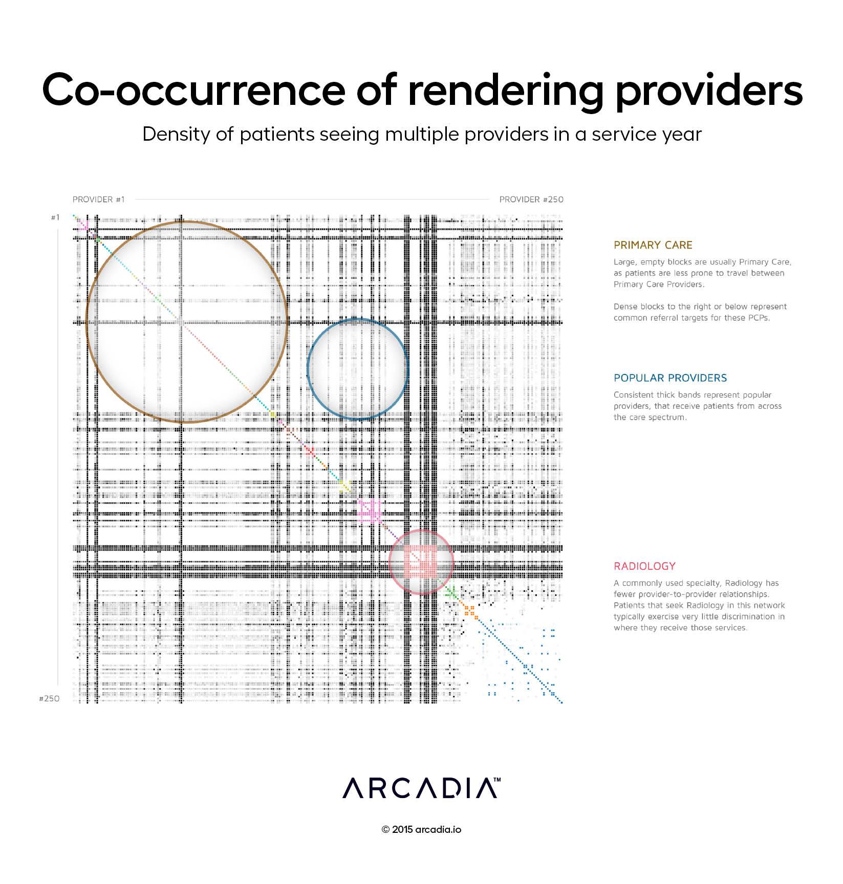
In this graph, 250 providers are arranged in the same order on the X and Y axes. The color intensity of each box in the resulting matrix represents the number of patients that have seen both providers in a given year, or how much the two providers’ patient bases overlap. The providers are then clustered by specialty, shown as the colored boxes along the 45° line.
The visual highlights some trends that we would expect. There is very little overlap between Primary Care specialties, as patients typically lock into a single provider. Conversely, radiology services see significant overlap, and show very little discrimination for which other providers are involved in a patient’s care.
High-volume providers are shown as dark horizontal and vertical bands, and aberrations — a lone dark or light spot — describes close relationships between two providers.
D3.js SVG, with Illustrator.
Data sourced from a 1.5 Million encounter sample from the Arcadia Benchmark Database.