This site uses cookies that are essential for our site to work. We would also like to use non-essential cookies to help us improve your browsing experience and help make this website better, by collecting and reporting information on how you use our site.
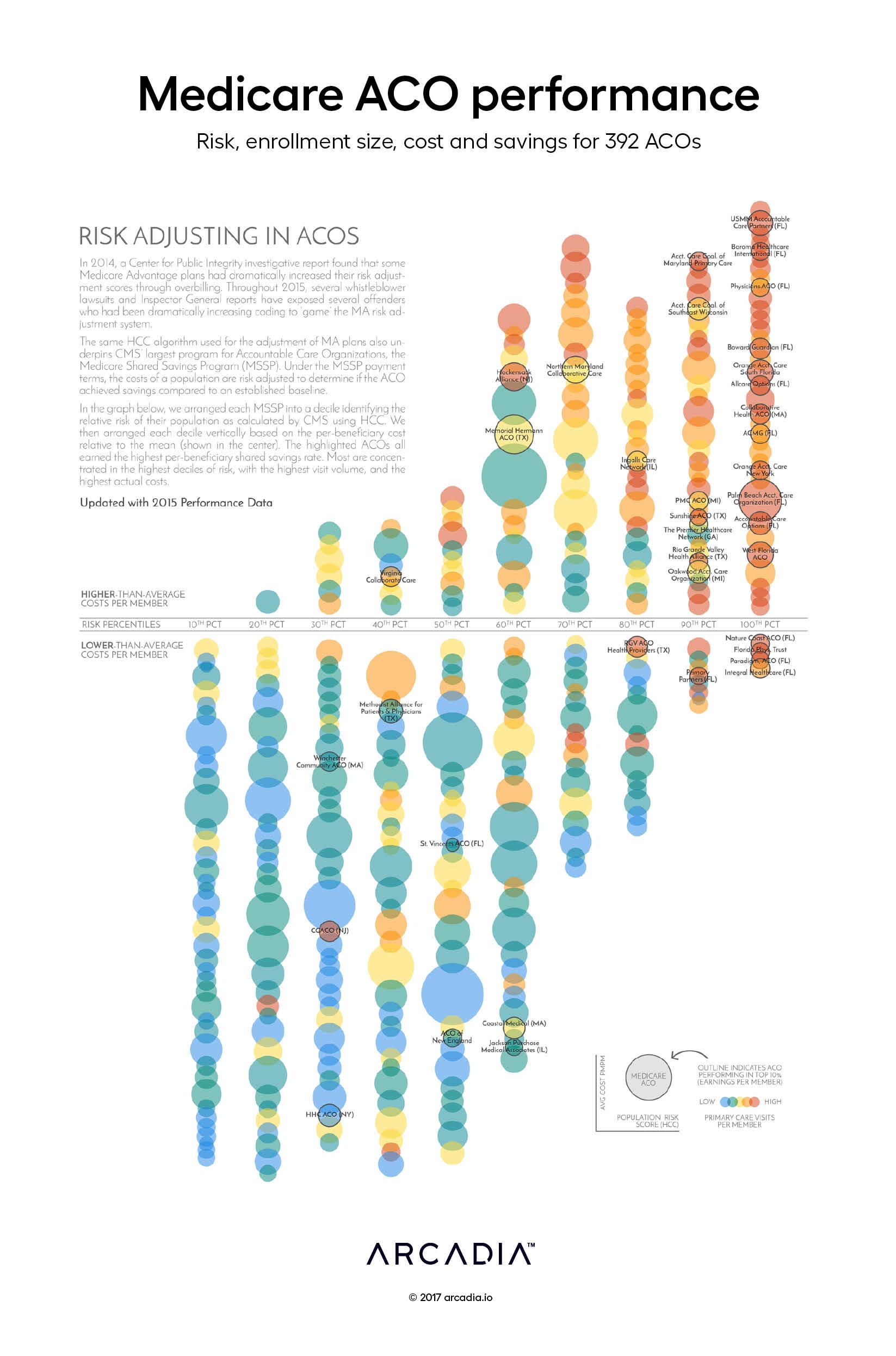
Risk scoring underpins many value-based payment programs. In the CMS Shared Savings Program, risk adjustment is critical to the fair calculation of the savings rate and, ultimately, the success of the ACO.
In this graph, the artist seeks to identify the relationship of risk-scoring to other factors such as cost, size and access. The most successful ACOs, judged by their earned savings rate adjusted by a quality modifier, are noticeably clustered in the top 30% of identified risk, and are also the highest-ranked for per-capita costs and per-capital outpatient utilization.
The bubbles, representing ACOs, are arranged by decile corresponding to the relative aggregate risk score of their populations. Vertically, the bubbles are arranged in order by cost per member. The sizes of their relative populations are represented by bubble size, while the color of each bubble reflects the per-member visit volume relative to the group, from blue (lowest) to red (highest).
Do more visits simply generate more coding leading to higher risk scores? Or do riskier populations need more services and the risk score is accurately smoothing performance? The graph doesn’t explicitly provide an answer. However, MSSPs have the data to accurately predict where they might land.
MSSPs receive fully-identified claims files that Arcadia uses to identify missed opportunities for improved risk scores based on clinical data. By highlighting these discrepancies, MSSPs see a more accurate representation of their population, as well as help care teams stay up-to-date on patient condition history.
Aggregate Training Day offers a customizable learning experience designed to meet you where you are — and take you further. Whether you’re diving into advanced platform capabilities or...
According to research from the CDC, approximately 129 million (nearly 40%) of people in the United States have at least one major chronic disease. Five of the top 10 leading causes of...
Whether operating under value-based care (VBC) contracts or traditional fee-for-service (FFS) models, improving care quality while managing costs is a major priority across the...