Insight
What Is Healthcare Analytics? The Definitive Guide
Healthcare analytics refers to the thoughtful use of data and statistical analysis techniques in the healthcare industry. Read this guide to learn more.

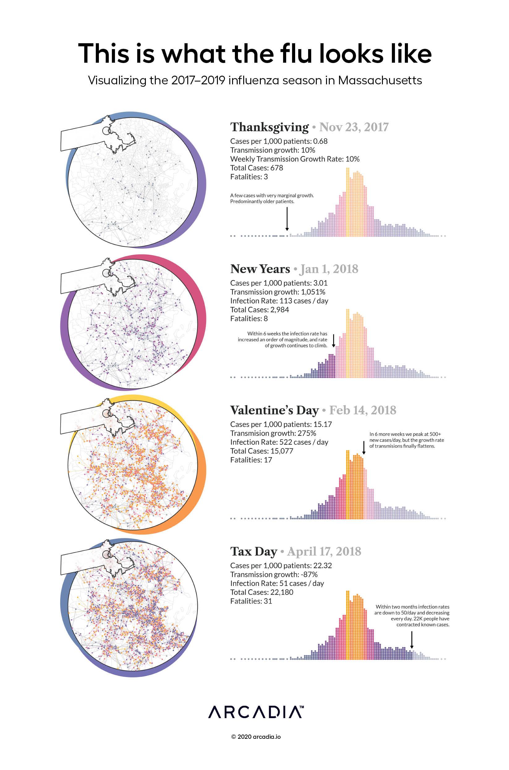
The 2017–2018 influenza season was the worst on record since the 2009 H1N1 swine flu. The CDC estimates 45 million people nationally caught the flu, with 810,000 hospitalizations and 61,000 deaths.
In 2020, viral outbreaks are on most of our minds. While mortality and transmission rates of the novel coronavirus (COVID-19) far exceeds those of the 2017–2018 flu, a look backwards can still be instructive. Even with its reduced virality, and the presence/distribution of vaccines, the 2017–2018 outbreak was explosive.
Looking at Massachusetts transmissions using medical claims data, we visualize not just the growth rate of total cases but the algae-like “blooms” of infections. A few small clusters at thanksgiving bloom into thousands of cases by new years, each interaction a potential for transmission. For the purposes of illustration, the artist draws a linkage between each new case and the closest person that had a diagnosis four days prior. This simulates the transmission graph as a social network of sorts, and highlights the importance of current calls for “social distancing” as we deal with an ever more deadly virus.
D3.js, with Illustrator
Data sourced from Commercial, Medicare and Medicaid claims from Arcadia Benchmark Database