What does your EHR look like? Visualizing the vastness and complexity of a typical EHR

The Electronic Health Record is a data goldmine. Each patient you see generates millions of detailed records in real time that can be extracted and analyzed for improved predictive algorithms, increased operational efficiency, better care quality, and so much more.
Unfortunately, EHRs are highly complex systems, and few organizations house the domain knowledge and analytical horsepower to fully take advantage of them.
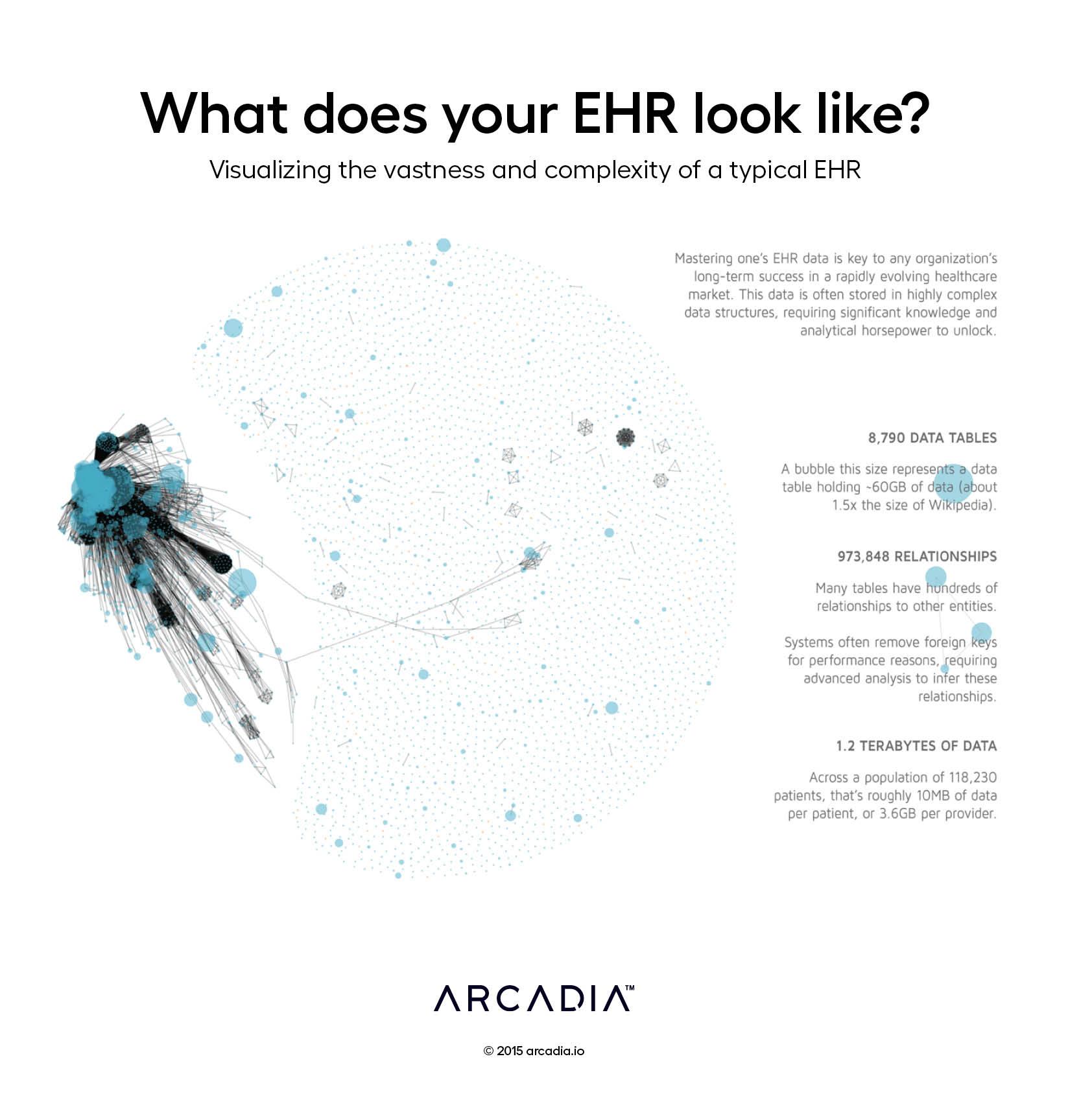
This graph is a stylized Entity Relationship Diagram, displaying each of the 8,790 data tables in one of the leading EHR platforms. Relationships between the tables are drawn as gray lines, inferred from shared attributes of each table. This particular visualization highlights a nucleus of sorts on the left – large, interconnected data tables that house the bulk of the clinical and operational data we care to extract from the EHR. To the right, thousands of satellite tables house system configurations and other low-volume metadata that has very few relationships to the nucleus. Amongst these satellites is the occasional small cluster of connected tables, shown as polygons of various sizes.
The total footprint of the database is 1.2TB – representing over 3GB of data generated by each provider in the system, or 10MB per patient.
Details
D3.js SVG, with Illustrator.
Data source from database metadata from a leading national EHR.
